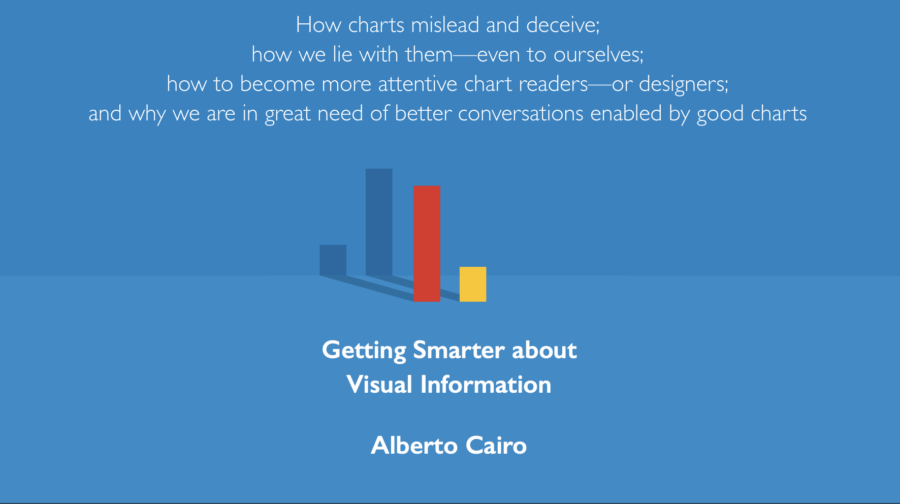
How Charts Lie: Getting Smarter about Visual Information
A leading data visualization expert explores the negative―and positive―influences that charts have on our…
- Books
- 973
A leading data visualization expert explores the negative―and positive―influences that charts have on our…
A leading data visualization expert explores the negative―and positive―influences that charts have on our perception of truth.
Today, public conversations are increasingly driven by numbers. While charts, infographics, and diagrams can make us smarter, they can also deceive―intentionally or unintentionally. To be informed citizens, we must all be able to decode and use the visual information that politicians, journalists, and even our employers present us with each day. Demystifying an essential new literacy for our data-driven world, How Charts Lie examines contemporary examples ranging from election result infographics to global GDP maps and box office record charts, as well as an updated afterword on the graphics of the COVID-19 pandemic.
Internet is huge! Help us find great content
Never miss a thing! Sign up for our newsletter to stay updated.
Research Stash is a curated collection of tools and News for S.T.E.M researchers
Have any questions or want to partner with us? Reach us at hello@researchstash.com